I liked how it turned out. Even with the drop-shadow addition, the letters look unprofessional and bold. I'm sure it will get better with more practice.
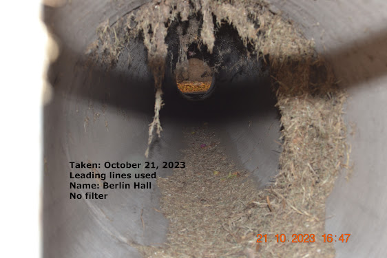
I love being creative and using my mind to think of new things. This looks like something I would find on a fall girls Pinterest page but it is a drainage pipe. I think beauty can be made out of anything. Even something like a drainage pipe.
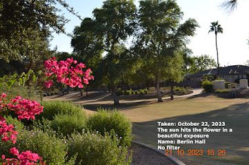
I love nature and everything that comes with it. I live hiking and bike riding. Running and skiing. Almost everything that has to do with the outdoors is something I love. I love the sun and pretty colors. This is one of my favorite pictures I have taken all year. Here is another picture of a pretty flower that we are lucky enough to find in our backyards here in Arizona. I love everything that has to do with the outdoors as I mentioned earlier. It was a vital part of my life growing up. At every chance we got (except in the summer) we went outside and played. I am lucky enough to live in a time era where this type of beauty is found in front yards and local parks. I love coming here to read during the weekends. It is my favorite spot, resting against the tree while its branches shade me from the sun. This has to be my second favorite picture I have taken this year. It looks like something out of google images but it is under a small bridge at my local park. I love how ...
I took this picture on October 29, 2023, in my neighborhood. As you can see from the tree right in the front, the light is shining directly on it, yet, there are immense shadows. The shadows are created my large trees behind me; I thought it was an interesting way to capture both elements of front light.


Oh this looks so cool! I love how the sunset looks and how the trees and other details are dark so it stands out!
ReplyDelete